TEAM
Chaehyeon Kang · Ruiwen Shou · Yunyu Liu · Hailin Chen
TOOLS / SYSTEM
Figma · XMind
PROJECT TYPE
Mobile Product Design · Information Architecture

Mediport is not a commercial medical product or service.
A health passport for travelers on daily medication
Mediport is a mobile app that carries a traveler’s medical information across languages. It was designed for people who take medication every day and hesitate to travel abroad because of what could happen if something went wrong.
I led the project in a team of four, planned and ran the research, and owned the information architecture.
How travelers prepared without a single system
Before designing, I interviewed potential users about how they manage medication when they travel. Their preparation was spread across paper copies, phone photos of prescriptions, and health portals at home. Abroad, the gap was language: one participant could not identify an over-the-counter allergy medicine because she could not read the label.
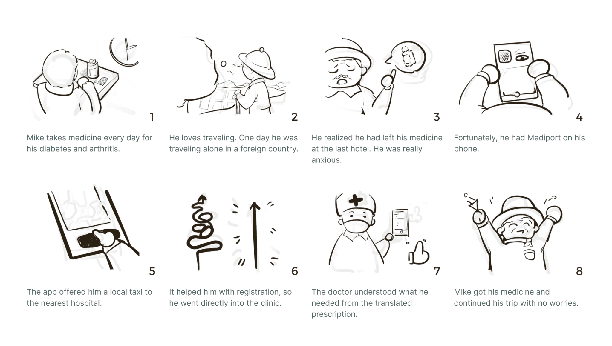
We explored a scenario in which a traveler loses their medication abroad and needs medical assistance in an unfamiliar language.
Open image at full size ↗
Storyboard by Yunyu Liu, interaction designer. This early storyboard explored a medication emergency abroad. Some proposed services, including transportation and clinic registration, were outside the final product scope.
Testing revealed what travelers needed most
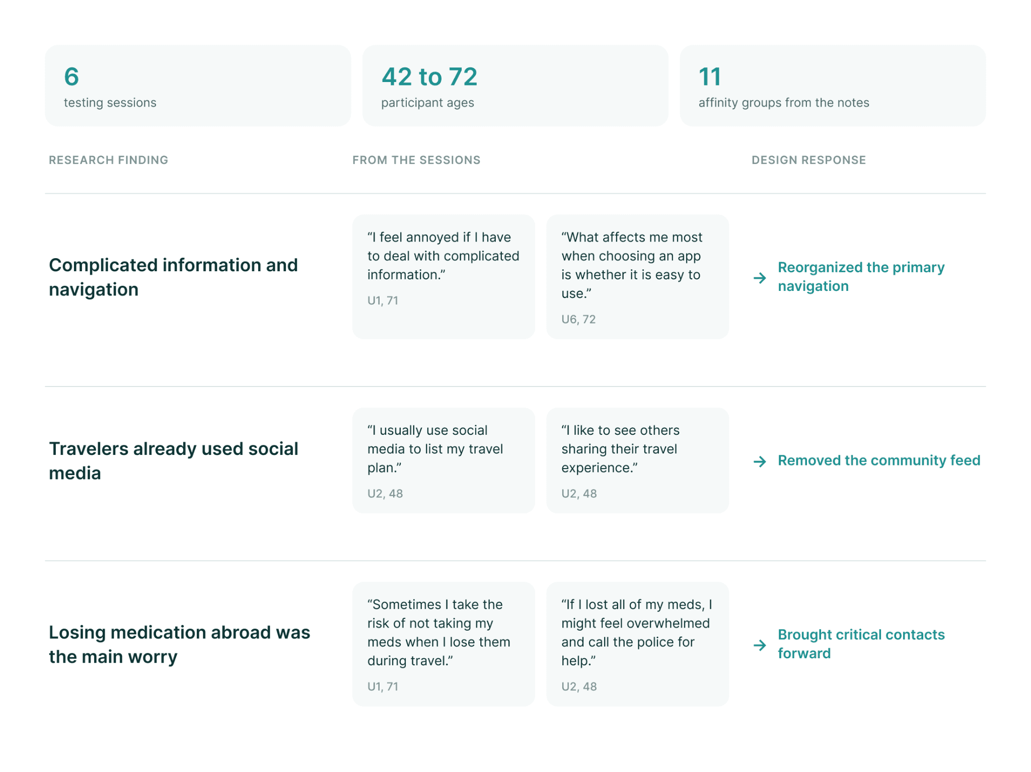
We tested the prototype with six travelers aged 42 to 72. Sessions began with questions about how they travel today and then moved through three tasks: finding destination information, entering health information, and locating the nearest hospital with a translated prescription.
Participants found the layout overly complex, and the amount of content hid the features they needed most. Some described complicated apps as a reason to give up. The testing gave us a clearer question: which features deserved space, and which needed to be easiest to reach?
Open image at full size ↗
Deciding what belongs in the product
The early concept included a community feed for sharing travel experiences. In the sessions, travelers told us they already planned and shared trips on social media.
We questioned whether Mediport needed to compete for their attention there. We removed the feed and focused the product on what it could uniquely support: carrying health information across languages and helping travelers reach critical information abroad.
Restructuring the app around critical access
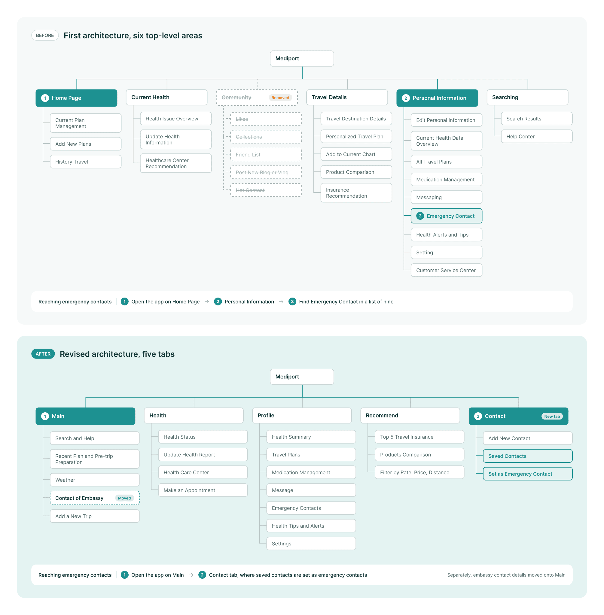
The first architecture had six top-level areas. Emergency contacts sat inside the personal information area as one of nine items.
I revised the structure after testing. The community area was removed, and embassy contact details moved to the main screen. Contacts gained a tab of their own, where travelers set who to reach in an emergency. Help center and customer service were merged into one place.
In an emergency, the most important information should take the fewest steps to reach.
Open image at full size ↗
The revised architecture removed the community area, added a Contact tab, and placed embassy contact details on the main screen. The highlighted path compares how a traveler reaches their emergency contacts in each structure. Paths are drawn from the two architectures and were not measured in testing.
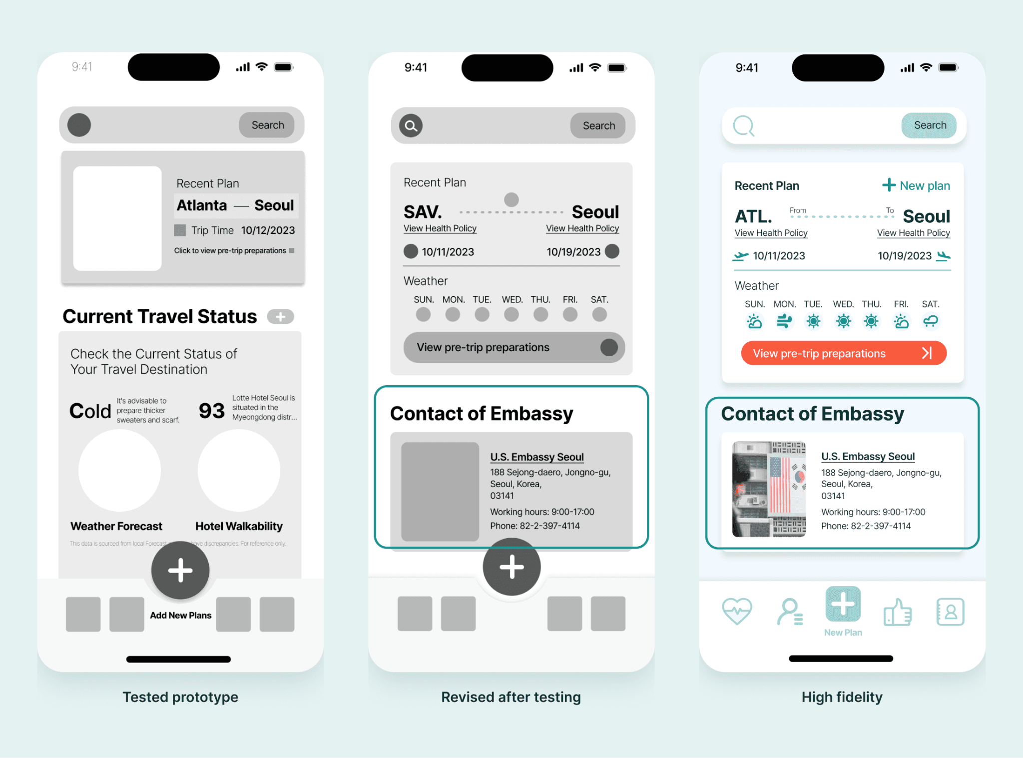
The main screen in the tested prototype, after revision, and in high fidelity. Embassy contact details appear once the structure changed and carry into the final design.
What this project changed about how I work
Mediport taught me to consider product scope and information hierarchy together. Removing the community feed helped clarify the product’s purpose, while bringing emergency information forward made critical support easier to find within the interface.
